Originally posted at the MIT Center for Civic Media blog.
In my last post about this year’s Eyeo Festival, I talked about the theme of “Respecting the Data.” Another theme baked into several panels and presentations was how to use data for social justice. In fact, many of the same, deep thinkers at Eyeo who weighed in on the former theme did so from a position of thinking about how data can be used for social justice, social change, and activism. An interest in creating work that could served as instruments of political messaging or even audience empowerment seemed to be shared not only by those who did such work in their day job, but also those spending a large chunk of their time on client work eager to employ their skills on meaningful side projects.
Challenging You
This train of thought again begins with Laura Kurgan and Jen Lowe’s “Multiple Dimensions” talk on the first full day of the festival. Kurgan offered an excellent example of using data for social justice by discussing her Million Dollar Blocks project at SIDL. The idea behind this beautiful and eye-opening data visualization was to show how the criminal justice system displaces not only people, in the form of the incarcerated, but also government money, in the form of the costs of incarceration, from neighborhoods affected by crime. In huge swathes of New York City, we can see millions and millions of dollars spent to incarcerate, and in many cases re-incarcerate, the residents of these city blocks. We are challenged to think about the idea of displacing these people far away from their homes and community, and to think about how all of that money could have been invested in infrastructure, social services, or anything else in those city blocks to produce lower crime and better outcomes for all.
Getting the Idea, the Picture, and the Details
Starting off the second day of the conference was a talk entitled “Visual Influence” by Maya Ganesh, programme director for Tactical Technology Collective. Tactical Tech is an internatinal human rights and technology organization, which works with bloggers, activists, and artists around the world on advocacy campaigns. They have a book — Visualising Information for Advocacy — coming out next month and an online guide “Notes on Data & Design,” from which Ganesh laid out a kind of social justice through data playbook.
Early in her talk, Ganesh stressed that she was a social scientist, NOT a technologist or designer. She said she was motivated by the question: “How do we understand this mysterious thing called information which is a part of who we are right now?” Her basic thesis was that the goal of information advocacy is accomplished by visualizing data at the appropriate level (kind of like units of analysis in my native social science parlance).

The highest level was Get the Idea, which is intended to hit you and then pull you in to ask more questions. Ganesh offered five ways this might be done. First was “juxtoposition,” exemplified by Children of the World India Trust’s advertisement (see image to the right), illustrating that there is no difference between a natural mother and an adoptive mother in terms of love. Second was “materialisation,” exemplified by James Bridle’s dronestagram, which uses Google Maps to “take” satellite imagery snapshots along the flight paths of drones. Third was “subversion,” exemplified by Icaro Doria’s Meet the World, which visualized data, such as the percentage of women in Somalia who endure female genital mutilaion, in terms of a country’s flag. Fourth was “contrast,” exemplified by Kamel Makhloufi’s “function” visualization of deaths in Iraq over time, alongside summations of the reasons for deaths; Ganesh explained that you have a sense of the scale in the time-based visualization (this is how we experience news like “ten died today in Iraq”), but the summation allows you to sense the impact. Fifth was “provocation,” exemplified by Greenpeace’s “Is this Yours?” images (see below).

The next level down was Get the Picture, which is about crafting a narrative and trying to draw an audience in by giving more information, taking more time and offering a more intensive journey into an area. She offered three options for how to achieve this goal. First was “show how we got here,” exemplified by GOOD Magazine’s US Health-Care Bill visualization winners, particularly Marco Giannini’s subway map, which offers multiple entry points, a historical timeline, and many different factors and facets. Second was “making something personal,” exemplified by Palestinian artist Majdui Haddid’s “Travel documents I needed to travel outside Palestine” (see below). Third was “scale meaningfully,” exemplified by BBC Dimensions’ “How big really?” series, notably the tool that shows how your own postal code in Britain would be affected by an event equivalent to the 2010 Pakistan floods.

Ganesh’s last, close-up level was Get the Details, which is almost “spreadsheet style” in that it offers all the data to the audience, and then the advocacy work is accomplished by providing detailed information that allows the audience to engage with it and come to their own conclusions. She adds that this is also how she sees the future of social media: a vehicle for crowdsourcing. To explore this approach, Ganesh used the famous “known knowns” quote by Donald Rumsfeld:
There are known knowns; there are things we know that we know. There are known unknowns; that is to say, there are things that we now know we don’t know. But there are also unknown unknowns — there are things we do not know we don’t know.
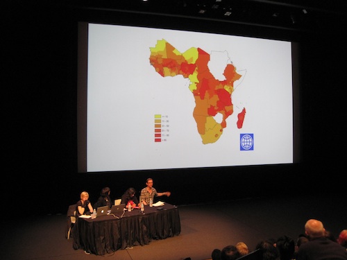
The first option for implementing this approach was “make the data meaningful,” exemplified by MySociety’s “Where does my money go?” which allows you to drill down — showing off the known knowns. Ganesh noted that this is not always possible with the data you have. Second option was “connect the dots,” exemplified by I Love Mountains’s “What’s My Connection to Mountaintop Removal” campaign, which allows you to see if your energy comes from mountaintops being blasted off, illustrating a known unknown. Third was “put the facts together,” exemplified by Sourcemap.org, by the MIT Media Lab’s own Leo Bonanni, which shows where the ingredients to your products come from. It was originally for consumers but now serves as an advocacy tool with which to instruct companies, representing another known unknown approach. Fourth was “fill in the gaps,” exemplified by Digital Monument to the Jewish Community of The Netherlands, which gives a dot to each Dutch Jew killed in World War II and allows you to fill in the information about these people. Fifth was “evidence,” exemplified by Trevor Paglen’s work as the co-author of Torture Taxis: On the Trail of the CIA’s Rendition Flights, which documents the means of looking at unknown unknowns indirectly, in this case uncovering the tracks left when a plane takes off from somewhere and goes elsewhere, which is always logged; Paglen goes through pages of flight records, finding flight routes for those that are likely rendition flights. Sixth was “piecing together facts,” exemplified by Privacy International’s Big Brother Inc project that maps out which countries produce and buy surveillance technology, and prints them in brochures distributred at industry events known as “The Wiretappers’ Balls.” Seventh was “from the ground up,” exemplified by Ai Wei Wei’s piece on the 2008 Chinese Earthquake school collapses. There was no documentation from the Chinese government about who died, so he worked with 100 volunteers over a year to find every child’s name and family and where they came from, and then printed them out and put them on display.
Opening Up Data for Others
I was really excited to see Cedric Sam at Eyeo presenting WeiboScope, a project much appreciated by Ethan and Civic Media. (Check out Sam’s slides online.) WeiboScope is an image browser for the Chinese Twitter-like service Sina Weibo, motivated in part by Sam’s poor grasp of Chinese since it allowed him to more easily appreciate the visual content of Weibo. The project is hosted by the Journalism and Media Studies Centre at the University of Hong Kong, and began while Sam worked there from 2010–2012. The first project they developed using Weibo’s data was the China Meme Machine, followed later by the WeiboScope image browser, and now the Sina Weibo Crypt. These tools turned out to be not just good for “research,” but could also help journalists covering China. Sam gives the example of the China Media Project, associated with JMSC, reporting on the death of a college student from Hebei province using information found on Weibo before there was a formal media announcement.
I was most excited about the unveiling of the Sina Weibo Crypt: a visualization of the archive of posts deleted by Weibo detected by Sam’s tools. It works because whenever the system gets a copy of a users’ timeline, it keeps it to compare to the next downloaded timeline. Deleted posts are indicated by more recent timelines returning error codes or “permission denied” in the case of political sensitive posts instead of the original post IDs. Sam said journalists get most of their juicy tips from these. He noted that Sina still hasn’t patched this loophole in their API!
This project also allowed Sam and others to quantify Chinese censorship for the first time, an effort that seems to aid in the known unknowns and unknown unknowns territory. In many ways, Sina Weibo has been a revolution for information dissemination in China. Rapid sharing helps evade censorship, as does the ability to share photos in posts, which some users exploit to attach snapshots of censored news clippings, which can’t be easily flagged for dangerous words like plain text. Developing a tool for making sense out of the large volumes of data produced by Weibo, Sam helped extend the service in even stronger social justice directions, inviting journalists and civic media researchers to document what is going on.
Sam gave a final example of his work supporting future, helpful projects: students in a class taught by Jonathan Stray used the JMSC’s tools to build Weibo Trends, which OCRs the text-based images to make them searchable. This prompted Jer Thorp to ask Sam about the Chinese government’s ability to reverse-engineer techniques like OCR for future censorship. Sam noted that the Weibo Trends tool was blocked in China within 24 hours, and that “there is a bit of an arms race going on.” The subtext of Thorp and Sam’s dialog seemed to me to be about the ethics of working with data like this. There is an inherent tension to Sam’s, and other similar, work; they are building tools that can oppress as readily as they can liberate.
Toward a Data Ethic
The Ford Foundation helped curate the panel “Lightness & Weight, Data & Social Justice,” featuring Kurgan and Lowe, and Ganesh again, as well as Jake Porway, founder of DataKind, whose tagline is “using data in the service of humanity.” For me, the most interesting parts of the panel discussion were the explorations of the tension between transparency and privacy, which I had found in Sam’s work. Kurgan talked about secrets moving from the scale of the globe in the case of NASA’s initially classified images of the whole Earth, to cities in the case of declassified satellite imagery, and now to databases, referring to the PRISM expose, which was published just a day into Eyeo. Lowe, who was moderating, remarked on the importance of privacy to social justice work before turning it over to Porway, who wasn’t so sure. Porway admitted that privacy was important but wanted to be convinced of its specific, deep importance to social justice.
During the Q&A, Ganesh responded to the question of privacy by saying that there was a difference between what you are told your rights are as a citizen versus as an individual; the result of which is different degrees of trust in the state. Furthermore, it’s different in the US compared to other parts of the world where people know they are being surveilled. Ganesh felt that anything having to do with social justice automatically involved privacy and personal rights. Kurgan felt similarly and reflected further on the PRISM expose by arguing that social justice is in question when we don’t know what we are being exposed to, no matter if we are rich or poor. To me, this touched on the need for an ethic around data. Rights are not just laws. When we talk about personal rights, we are referring to the possibility of a human right to privacy, such as that which many countries purportedly observe in Article 12 of the Universal Declaration of Human Rights. This is makes the decisions about how we collect a use data, moral and ethical questions — something that has been observed in research for a long time.
The discussions around how to respect data are relevant to this question, particularly the connection between ethnography and data collection in understanding where data comes from, and thereby how it might be used appropriately. Back in the panel, Kurgan responded to the question of what she thinks of when she thinks of social justice by saying that she tries to get really specific about what the problem or issue is that people are talking about when they refer to social justice, rather than leaving it at that broad title. Only then can she start working on the problem, which still begins by bringing together particular stakeholders and experts to work on the issue rather. Social justice through data shouldn’t begin with a broad problem definition like “poverty.”
A member of the audience touched on the same question Thorp asked of Sam, asking if the Feds — who have the ability to render things visible you cannot — came to your studio and asked to repurpose your work, how would you deal with that problem? More generally, how do we frame this issue of ethics where the technology we develop can be repurposed for these acts of “violence?” Porway agreed that the responsibility for the data you hold is a tough ethical issue if the government asks you for it. He endorsed efforts like the Locker Project and Open Paths, which allow you to protect your data while still providing services on top of that data. Ganesh referenced a proposal for a Canadian national identity card that would be multifaceted, such that you only have to reveal certain aspects of your identity in a given situation rather than the whole card. Ganesh extrapolated by asking, “Is there a way you can make it so that we can break up the data so that you don’t have to hand over the entire box?” “It’s a political question.” Kurgan followed by saying she thinks it’s an ethical as well as a political question. In the case of the Feds coming in, she felt she might deny them access if she believed that the data would compromise people unduly. On the other side, she noted that there are some folks who simply refuse to use GPS or other data services because they are military technology. There are trade-offs wherever you stand, but you have to be able to stand up for what you do; Kurgan admitted that she had made maps that were used in “the wrong way.”
Squeezing in Social-consciousness
During the panel on failure, Wes Grubbs talked about his visualization of Pakistan drone strikes “Out of Sight, Out of Mind.” His story was about how much was missing from the final visualization that his team had intended to include, but because of the narrow window in which they had to finish the project between client work, they just needed to get it out there. What I took away from Grubbs’ story was his desire for more time to do projects with potential political impact. Throughout Eyeo, several speakers spoke about the struggle to find time to do personal, more meaningful projects between the client work that fed them.
I didn’t attend Kim Rees’ co-led workshop, but I noticed the tag-line on her company’s website: “Periscopic is a socially-conscious data visualization firm that helps companies and organizations promote information transparency and public awareness.” I don’t know the backstory to her drive or ability to found a “socially-conscious” dataviz shop, but I’m curious how many other coders, designers, and artists on the stage and in the Eyeo audience wish they could have a similar mission statement rather than simply squeezing in such work as side projects.
This theme of carving out time from client work to do more meaningful work culminated in Sha Hwang’s closing keynote. Sha revealed that he is planning to fund a fellowship for data designers to work on projects for a year that have broader impact. I’m excited about the opportunities that this fellowship may open up. There are dozens if not hundreds of deserving folks among Eyeo’s ranks that should have the opportunity and freedom to use their creativity and skills to push for social justice through data. In my mind, the ideal fellowship project might look like a cross between my colleague Rahul Bhargava’s Data Therapy workshops and JR’s Inside Out Project.
I’m also acutely aware of how fellowships are part of the academic model that I enjoy at MIT. Major philanthropic foundations like Knight and Ford pay for my tuition and stipend, and expect me to fulfill my passion for research and coding and employing data for good. This can sound and even sometimes look a lot like doing client work that just happens to align with your own passions and interest. But academic freedom, especially at the Media Lab, can also look like the creative freedom Memo Akten talked about at Eyeo: the ability to take a design brief from a client and rewrite it to match your own vision for a potential project.
The question that I get stuck on then is: What does impact look like? Client work might have impact by offering exposure to a brand or to drive new or continued business to a client. We already know from Kurgan, Lowe, and Ganesh that data is not neutral, but neither is it inherently actionable. Brands have campaigns in which advertisement, data-based or not, is situated in order to have impact. Even when data is visualized and expressed as “useful” information, there is a need for it to be situated in a larger context. Because Eyeo focuses on the visualization of data, I think it’s easy to forget that it’s utility for social justice work comes from being embedded in a campaign: it has “an ask.”
Linking Data and Action
During the Social Justice and Data panel, Ganesh talked about the difficulty of triangulating disparate data and suggested that you should make data part of your campaign by including an ask for help filling in, verifying, and fixing the data. The part of the story missing from much of the work displayed and discussed at Eyeo was “THE ASK.” As data visualizers, we strive to make clear the patterns in data, and to make information compelling. And we tend to rely on an assumption about our audience that once they get the idea, the picture, or the details, they can and will take some action. Obviously, most of the projects at Eyeo were not inherently about social justice and taking action. If there was an ask involved, it was an implicit request that the audeince be informed and/or entertained. There were subtle projects as well that were integrated into a larger philosophy of education (a topic I hope to explore in a third blog post about Eyeo), but few were designed with an explicit demand for action.
Ethan Zuckerman just published a thoughtful blog post entitled “Linking news and action,” in which he wrestles with the possibility that reading the news is actually bad for its consumers. The logic is that an accurate news article can convey the enormity of a problem, but without offering concrete suggestions for how to respond, it actually disempowers them. What counts as good data visualization can do the same thing. Does Pitch Interactive’s drone visualization or Periscopic’s U.S. Gun Deaths visualization make us feel ready to pursue justice, or do we feel aghast and then ultimately numb by the stark reality?
As my colleague Molly Sauter argues in a recent op-ed for io9, information distribution, like the exfiltration work of Ed Snowden and Wikileaks, is a political act. The implied hope is for some form of social and political change. But what is the ask of data exfiltration? Do we hear about all diplomatic cables, uncounted civilian deaths, and evidence of government spying and feel empowered or disemwpowered? The ACLU has sued the government as a result and other activists are organizing campaigns to petition Congress for more oversight and new legislation protecting citizens against domestic surveillance. These are the campaigns; they are asking for your support in donations or signatures.
It may seem like I’m arguing that we need to be very explicit about how we instrumentalize data and data visualization in order to have impact. But that’s not necessarily true. I think it goes back to what I was saying in the last blog post about less control can be more in some cases. We can also make actions part of the process of creating our work like Ganesh suggests, or like we try to do at the Center for Civic Media with our focus on co-design, empowering those who need a tool to build it themselves. Kurgan’s Million Dollar Blocks was an iterative process bringing together stakeholders, including state and local issues around the shared issue of public spending and incarceration. Goals and asks can be about starting conversations. In the framework for civic action we are working on here at the Center, we have identified levers of social change that work through slow, cultural shifts. Awareness of the world, helpfully decoded and visualized, can be critical to that. At the same time, we should be sensitive to it’s potential to disempower or even trivialize.
So my hope is that we, of course, create more work using data that is aimed at social justice, politics, and social change. We have good examples in our midst. But for whomever wins Sha’s fellowship, I hope they reflect on the questions raised during Eyeo, and maybe find a “theory of change” for their project — Ganesh and Tactical Technology Collective offer a great set of ideas and examples as a starting point. I want to see beautiful projects supported by deep understanding of context and ethic, and thinking in terms of campaigns with opportunities for action.